| Author |
Message |
lukaszenko_PL


|
 Friday, August 19, 2011 Friday, August 19, 2011
desert and desert2
http://www.megaupload.com/?d=XKCGTWBQ
where do I find the these programs or netradiant 3dsmax and more to creaty
Brolly Super Saiyan 4
http://www.megaupload.com/?d=3H1ZQ69Q
Menu tenkaichi 3
|
NELLO!!
 Mitico
|
Friday, August 19, 2011
I have question ..desert and desert2 have the same texture?
|
suckapunch

|
Friday, August 19, 2011
love that menu

|
|
lukaszenko_PL
|
Friday, August 19, 2011
NELLO!! wrote : I have question ..desert and desert2 have the same texture?
no other like the pictures
|
|
NELLO!!
Mitico
|
Friday, August 19, 2011
okay
|
|
lukaszenko_PL
|
Friday, August 19, 2011
NELLO!! wrote : okay
where do I find the these programs or netradiant 3dsmax and more to creaty
|
skkyper

|
Friday, August 19, 2011
nice menu
|
|
NELLO!!
Mitico
|
Friday, August 19, 2011
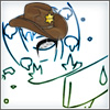
you like also my menu
|
|
lukaszenko_PL
|
Friday, August 19, 2011
NELLO!! wrote : you like also my menu
nice bat I like more colors
|
|
NELLO!!
Mitico
|
Friday, August 19, 2011
no I'm more serious I don't like more colors
my grafic is better ..

|
|
lukaszenko_PL
|
Friday, August 19, 2011
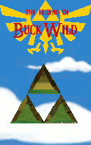
Menu
|
Zeth
 The Admin
|
Friday, August 19, 2011
"Better" is subjective.
Both of you need to work on your typography usage. Don't embed credits and unnecessary text in your menu background. If you must use text, make sure it contrasts enough to remain visible, but stays uniform to your overall color palette (neutral shades on the gray scale help here). Additionally, you don't want to embed existing logos or graphics that have aliasing or clipping issues as this will just lower the quality of the image overall.
Make sure your menu fits and plays nicely with the existing elements in play as well. Remember that there's the logo in the upper left corner, menu buttons on the side (try changing these graphics to help), and the character in the bottom right corner.
Less busy details and more minimalism will let the user focus on the actual menu options that exist without feeling overwhelmed.
|
|
lukaszenko_PL
|
Saturday, August 20, 2011
where do I find the these programs netradiant or 3dsmax
Help ???
|
|
lukaszenko_PL
|
Sunday, August 21, 2011
GohanFuture
C 17
Link:
http://www.megaupload.com/?d=FW078D47
|
Linkxp500
|
Sunday, August 21, 2011
Looks good, Luka 
EDIT: Downloading now.
EDIT #2: I like it, except for the glow from the emblem on Gohan's back. Also, I don't know his attacks, but is that his stance when he charged for his last attack? Or did you just copy that from Goku's Spirit Bomb?
|
|
lukaszenko_PL
|
Sunday, August 21, 2011
Linkxp500 wrote : Looks good, Luka
EDIT: Downloading now.
EDIT #2: I like it, except for the glow from the emblem on Gohan's back. Also, I don't know his attacks, but is that his stance when he charged for his last attack? Or did you just copy that from Goku's Spirit Bomb?
emblemats is our original GohanFuture without him it was plain to Gohan
|
|
Linkxp500
|
Sunday, August 21, 2011
The glow is what I don't like. Keep the emblem, remove the glow. There's no reason for the emblem to glow.
|
LokiLorester

|
Monday, August 22, 2011
luka you are really trying your best on these if I would take a guess....honestly I don't really like the HUD for the life and energy, some of the maps except the dark Namek.........I was straight out  ...and then there is the characters which are very good also ^^ ...and then there is the characters which are very good also ^^
Main Response: Keep on doing your best cause this will give you more experience on making epic models like Nello!!
No more words... sorry.. *laughing out loud* look below for more comments...(IF THERE IS ANY!!)
|
|
lukaszenko_PL
|
Tuesday, August 23, 2011
Mejin Vegeta
Link:
http://www.megaupload.com/?d=R5WZZ3Z1
|
|
lukaszenko_PL
|
Thursday, August 25, 2011
Gohan Cell
|
|
Konan
|
Thursday, August 25, 2011
Keep up the good work. 
|
|
NELLO!!
Mitico
|
Thursday, August 25, 2011
nooo why you use Goku body?...hey why you don't use vintage model? is better , but you know that has bugs...
|
ssj6vegeta
|
Thursday, August 25, 2011
you have to delete the under shirt and create a body..otherwise just a recolor that isn't much 
|
|
lukaszenko_PL
|
Thursday, August 25, 2011
175 0 0 5 // FLY IDLE
indifferently animation in which a character variable Fly will look like in such a position or Gohan Goku kai
|
|
lukaszenko_PL
|
Friday, August 26, 2011
Gohan
Link:
http://www.megaupload.com/?d=RK43Y0EJ
|