| Author |
Message |
qwerty
 In Advance


|
 Wednesday, January 18, 2012 Wednesday, January 18, 2012
First
 
After


|
Dokumas
 Jamaicabronx
|
Wednesday, January 18, 2012
WOAH...That looks A LOT better just like the anime! Spectacular work man! 
|
mcgrass
 Beta Trapezoid
|
Wednesday, January 18, 2012
Nice but the edges are so sharp 
|
Linkxp500
|
Wednesday, January 18, 2012
Dokumas wrote : WOAH...That looks A LOT better just like the anime! Spectacular work man!
The quality of the work is excellent, that much I agree with, but I disagree with your statement about the anime. I don't intend to start an argument, just voicing my opinion. I can do that without issues, right?
|
|
Dokumas
Jamaicabronx
|
Wednesday, January 18, 2012
Linkxp500 wrote : Dokumas wrote : WOAH...That looks A LOT better just like the anime! Spectacular work man!
The quality of the work is excellent, that much I agree with, but I disagree with your statement about the anime. I don't intend to start an argument, just voicing my opinion. I can do that without issues, right?
Hehhe yeah. 
|
|
Konan
|
Wednesday, January 18, 2012
Hm..if I can remember, you can change simply the thickness of outline(like in Naruto: Naiteki Kensei) in the ini file..
|
|
qwerty
In Advance
|
Wednesday, January 18, 2012
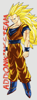
I used a filter of Gimp. Erosion.

Original

Modiefed

|
Zeth
 The Admin
|
Wednesday, January 18, 2012
Hm..if I can remember, you can change simply the thickness of outline(like in Naruto: Naiteki Kensei) in the ini file..
That would be for rendered lines, not textured ones (as is the case here). You can alter the thickness and opacity of rendered lines (silhouette only currently) in ZEQ2-lite by using the r_outlines and r_outlinesAlpha keywords in the console.
I'm not sure I'm understanding the point of these texture changes though. The lines are simply more bold/thickened by a filter process. Do you have any referential evidence supporting that this is more accurate? Due to the blunt contrast and indirect blur created by the new lines, it certainly loses a lot of its aesthetic by not remaining as soft and uniform.
If you are going for line styles akin to that of the earlier series, you might consider reworking these things by hand to preserve the fidelity that's going to be lost (and misapplied) by utilizing a global filter.
|
VladUzumaki
|
Wednesday, January 18, 2012
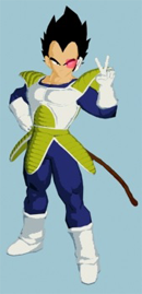
Sorry qwerty but I don't like because lines so big....
|
Buksna
 Blaizing
|
Thursday, January 19, 2012
*laughing out loud* - you actually did double thicker line on the eyebrows 
|
|
Konan
|
Thursday, January 19, 2012
Buksna wrote : *laughing out loud* - you actually did double thicker line on the eyebrows
I see..

|
JayREEZY

|
Thursday, January 19, 2012
This is an outrage! this isn't Budokai Tenkaichi 3!? 
|
ssj6vegeta

|
Thursday, January 19, 2012
this actually doesn't look that bad even though I'm not an officianado on what is better for ZEQ2Lite
|
|
Buksna
Blaizing
|
Thursday, January 19, 2012
What I'm referring to is thicker lines on eyebrows, not thicker eyebrows (which are because of it :/)
Your point was to add thicker lines to make it more anime-ish. It actually works when you add lines on different colors but adding thicker BLACK line on already BLACK eyebrows won't make it look more anime-ish. It will only be thicker...
So you could've just left it out too...
|
|
qwerty
In Advance
|
Friday, January 20, 2012


|
Hogeta

|
Saturday, January 21, 2012
+
/r_outlines
=
AWESOMENESS!!!!!
|